BRIEF
Rohrig was a rapidly growing player in the Brisbane construction industry, with a very outdated brand (bottom). Known for their design credentials as well as construction excellence, they wanted their brand to reflect durability as well as aesthetics.
APPROACH
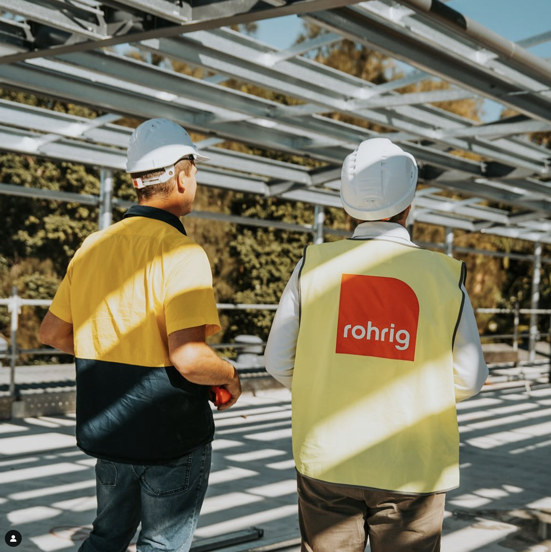
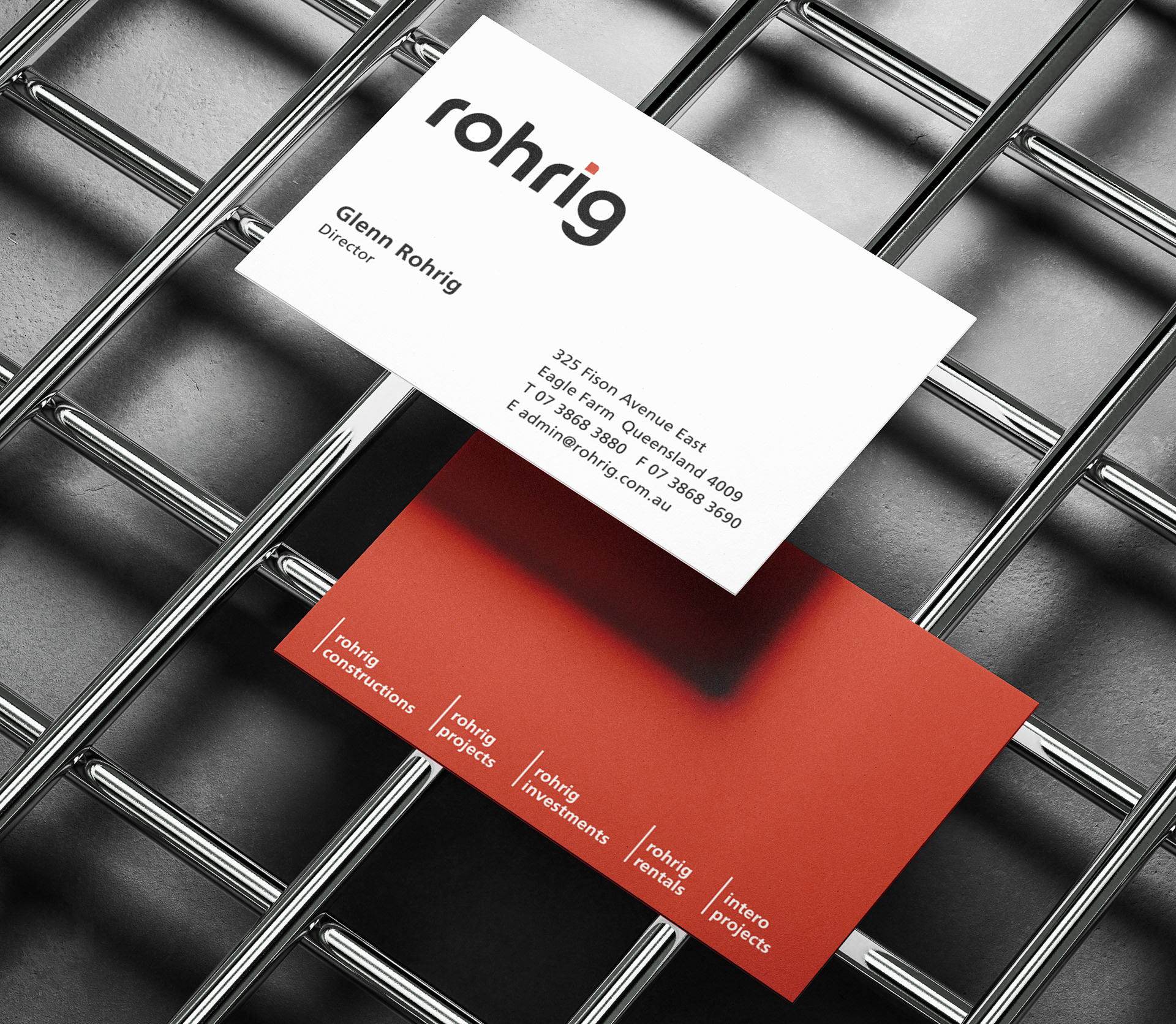
I retained the essence of the original brand, redrawing the letterforms to create a clean, timeless and cohesive appearance. I reinterpreted the seemingly superfluous black dot, bringing it into the logotype. The resulting 'dot' form then enlarges to contain the logotype on uniforms and signage.
RESULT
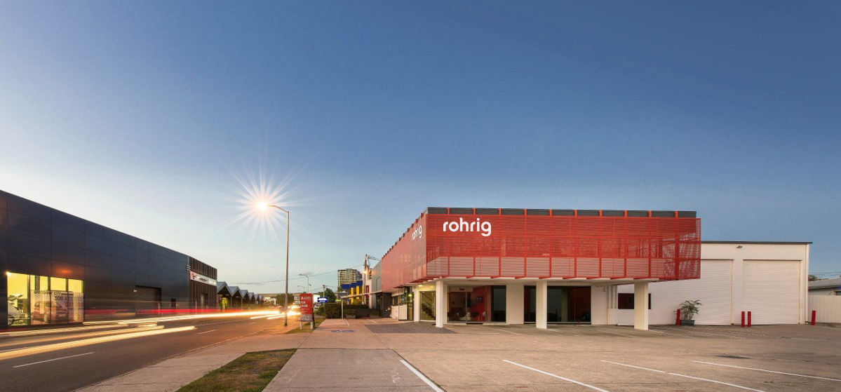
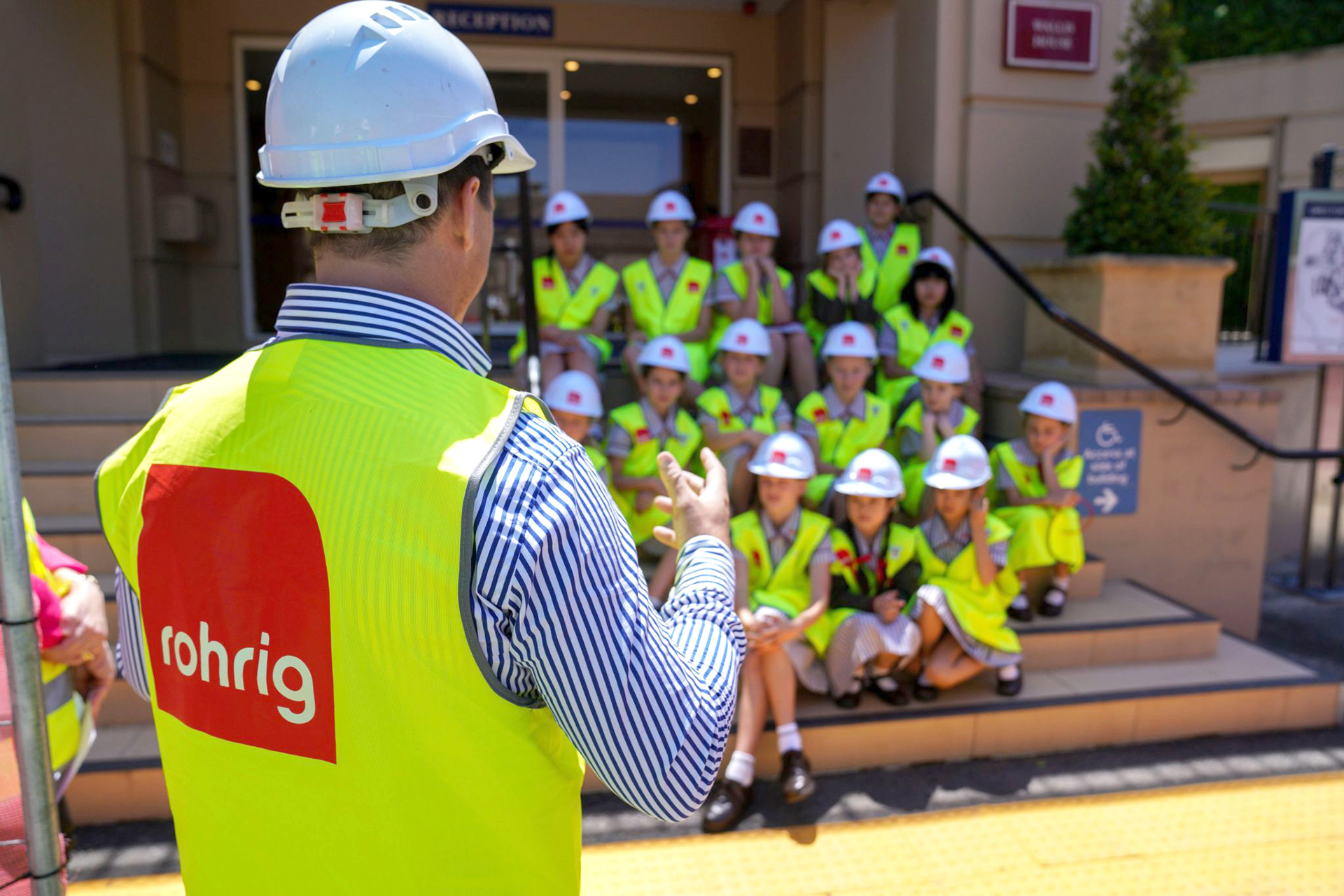
This brand has remained unaltered for over 20 years and maintains a striking appearance on many sites all over Queensland and New South Wales.

ORIGINAL BRAND –