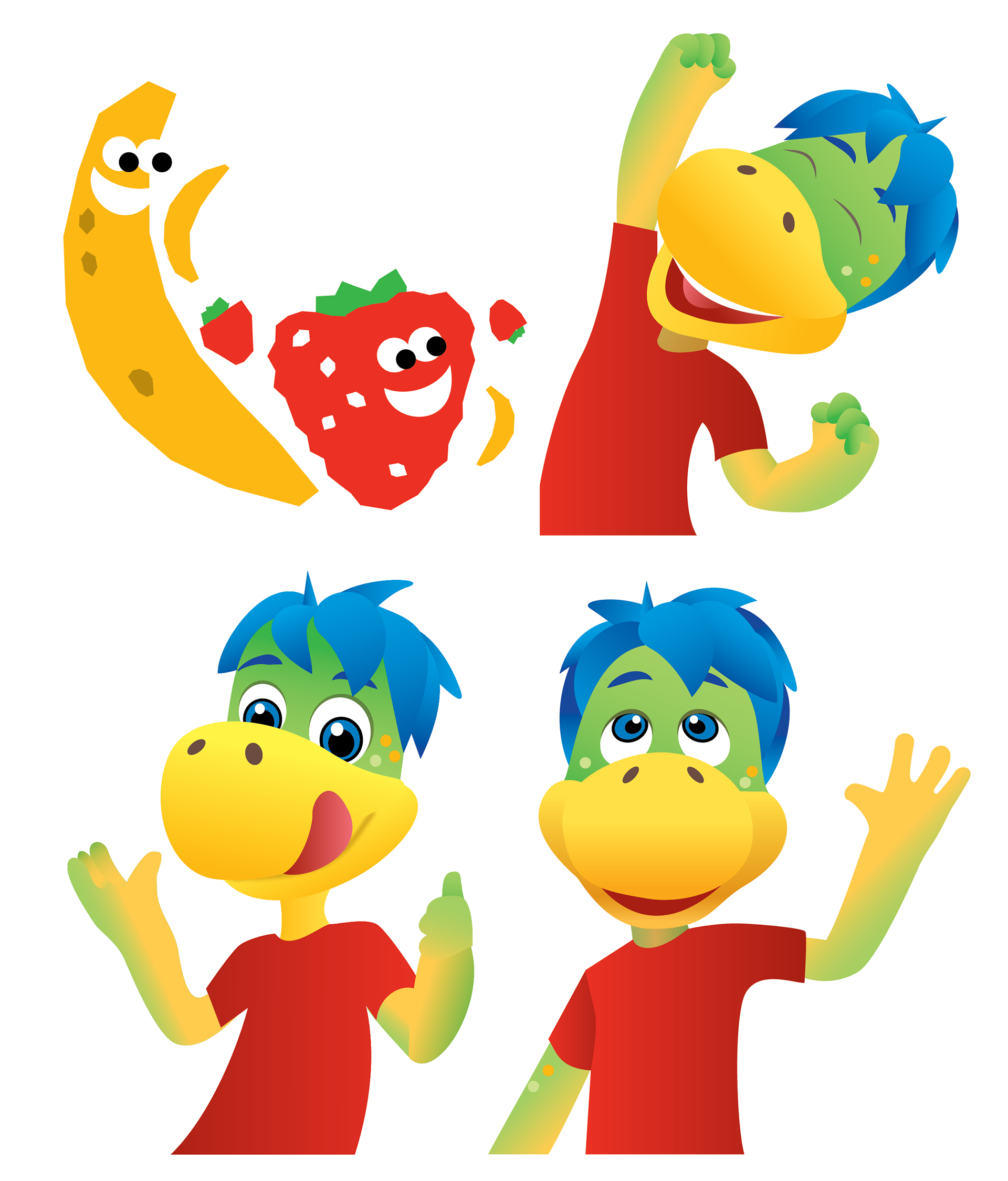
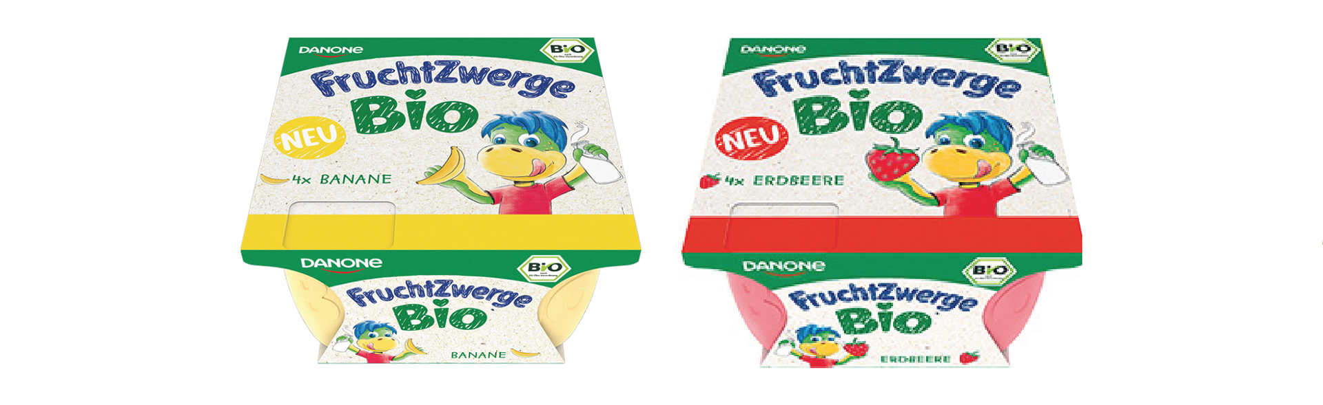
Danone's new organic range of kids' yoghurts needed to represent a healthy ethos, while maintaining strong shelf appeal. Over four days, I created two concepts. The selected concept (top) includes a simplified hero character, hand-drawn typography and cut-out fruit friends – steering away from the shiny 3D plastic styling of Danone's regular product ranges for children.
The concept was chosen for roll-out by the client and ultimately retained my proposed look and feel (bottom).
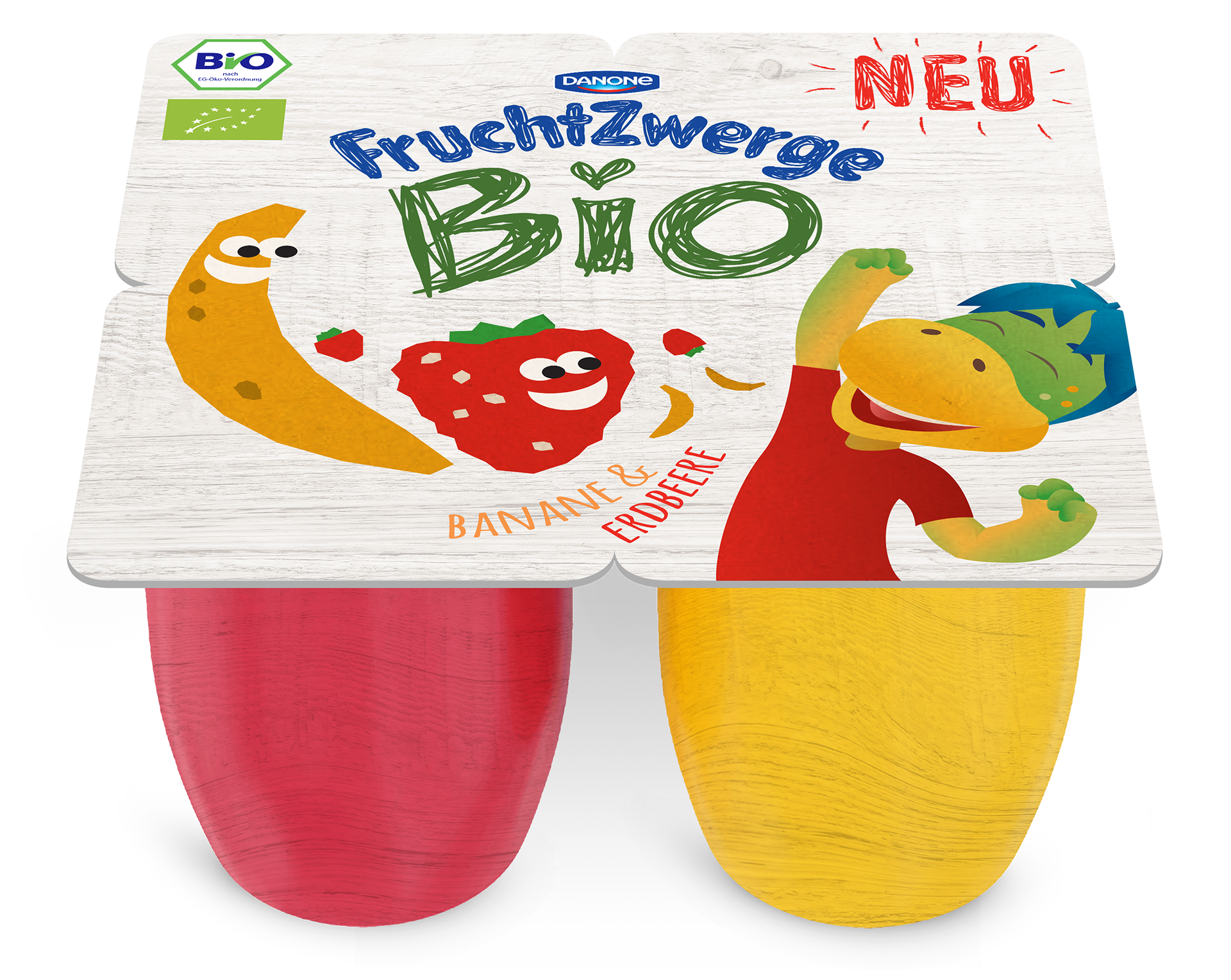
CONCEPTS –

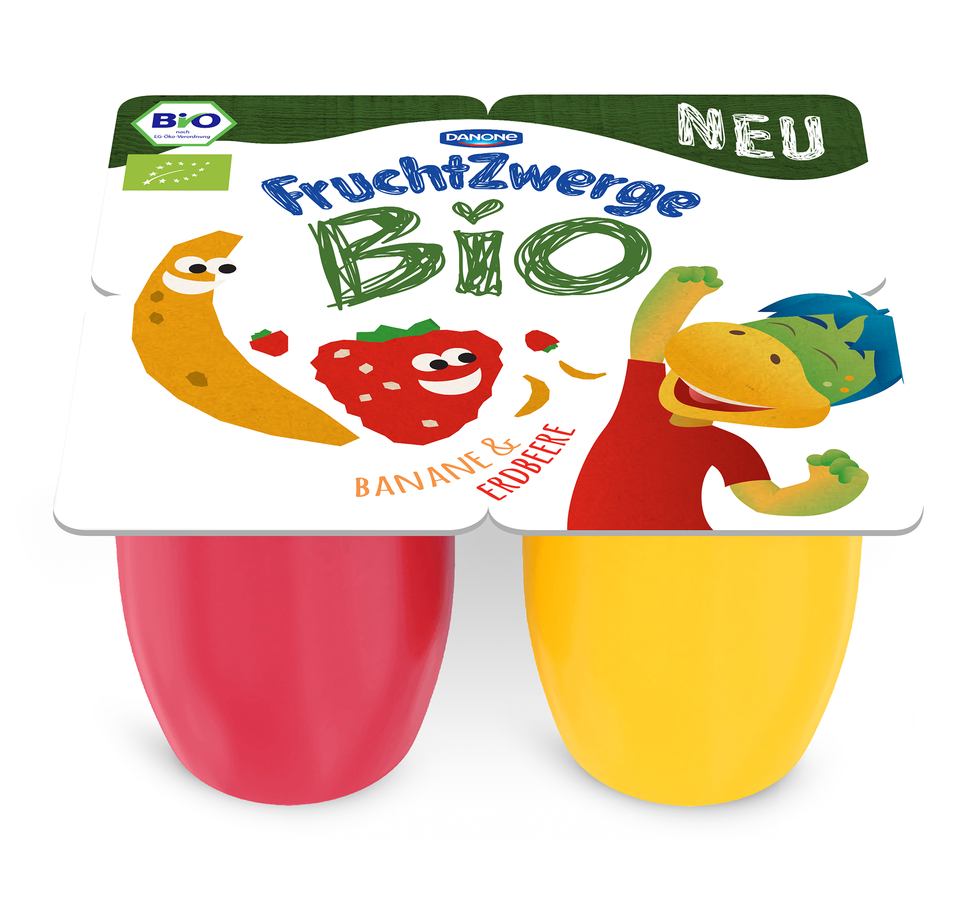
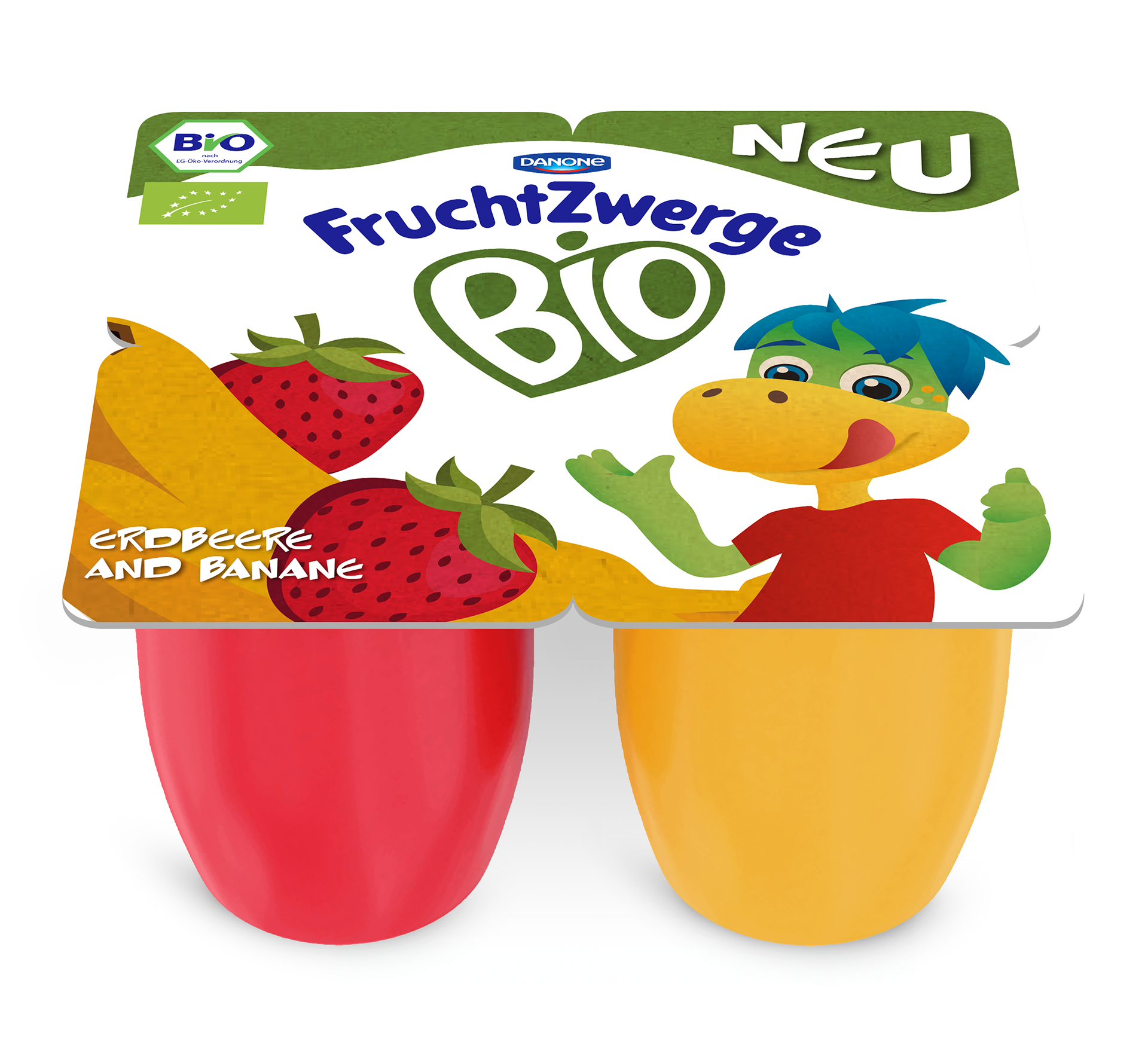
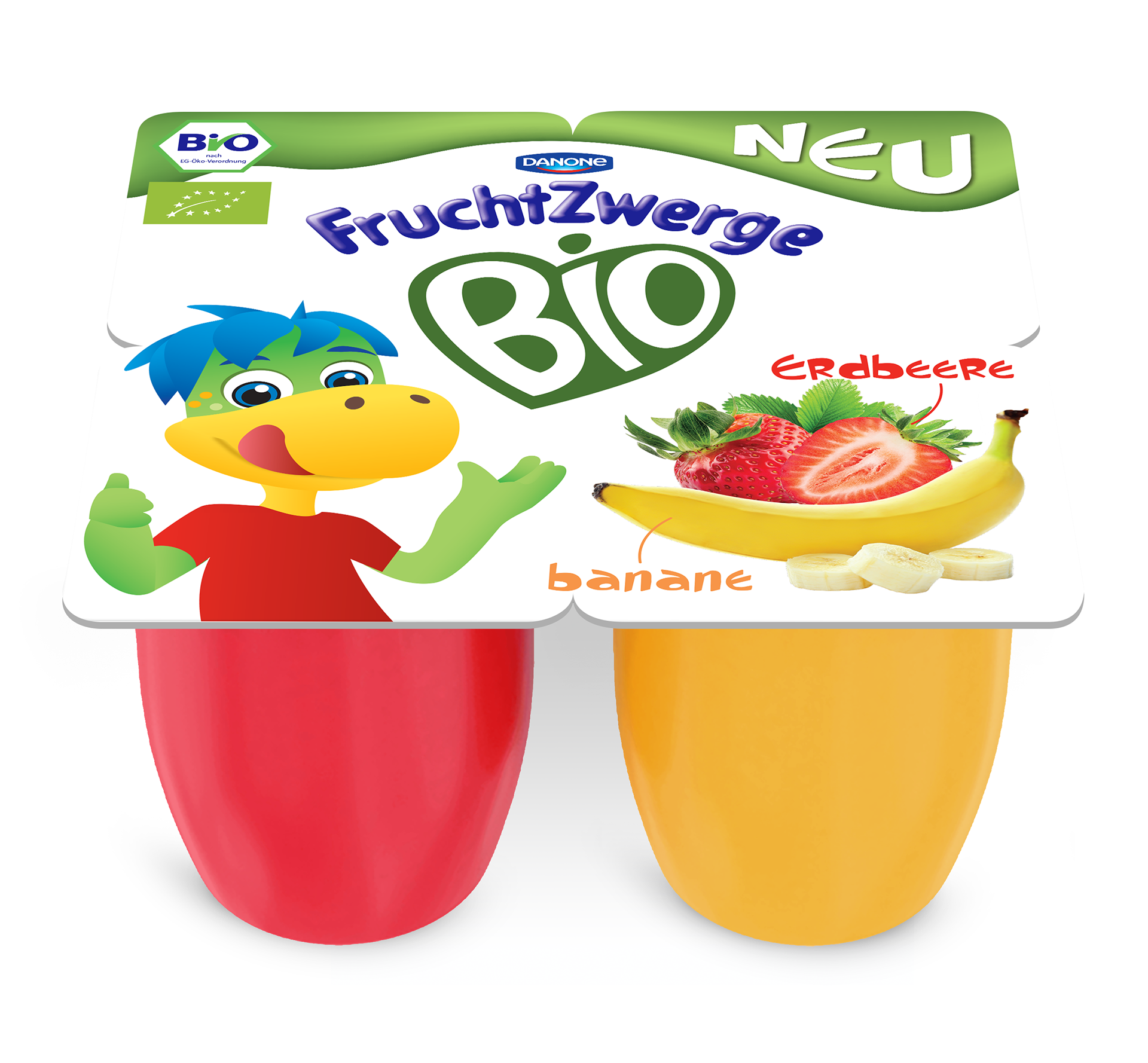
ILLUSTRATION REFINEMENT –
FINAL PRODUCT –
ORIGINAL PRODUCT –